Table of Contents
Introduction to Mobile Screens and Styling
Introduction to Mobile Screens and Styling
When people learn to code for the first time, they often start with HTML and learn to build web pages. As we pointed out in the last lesson though, we don’t have HTML in mobile apps! This lesson is going to be a short and sweet introduction to the building blocks of mobile screens and styling.
Lesson Outline
Here is what we will cover in this lesson:
Mobile screens - how to conceptualize and create screens for your mobile app Flexbox for screens - Flexbox plays an important role in making mobile layouts Styling screens - how to add CSS to your mobile screens
Lesson Preparation
Here are some things you can do to get the most out of this lesson:
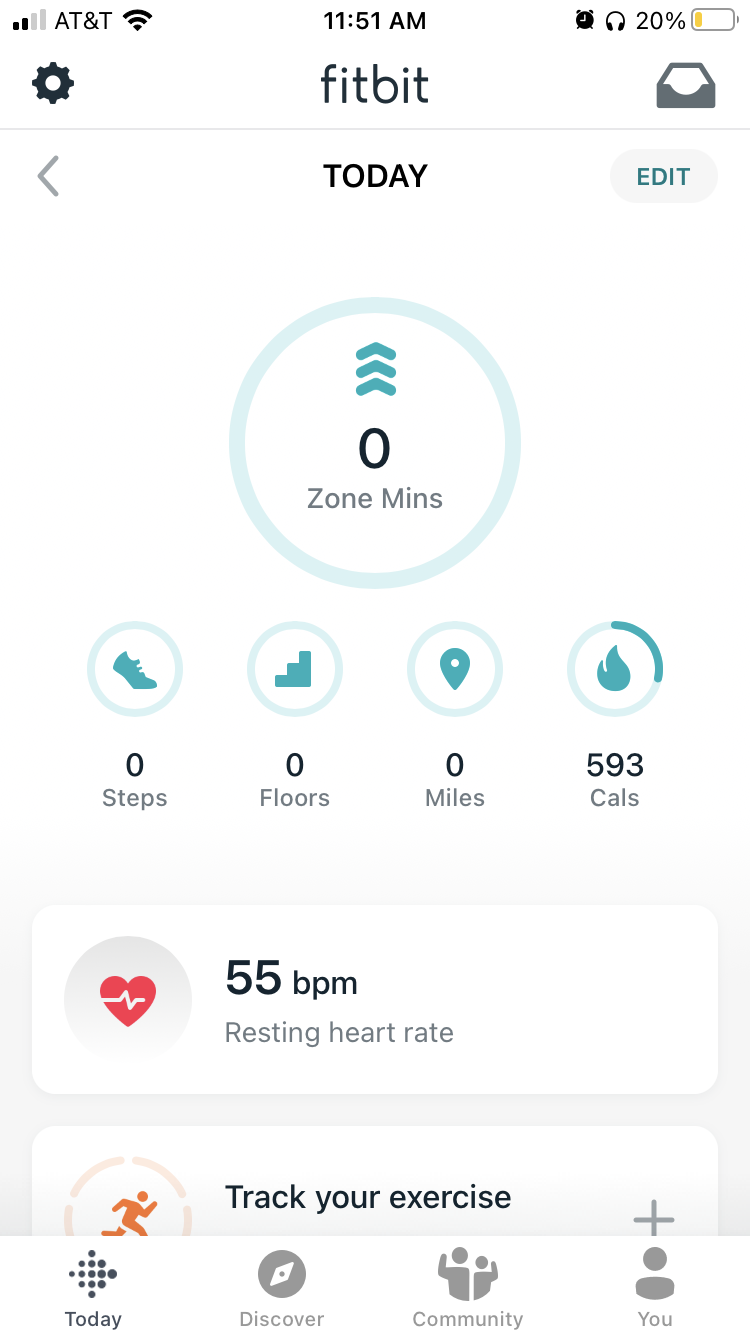
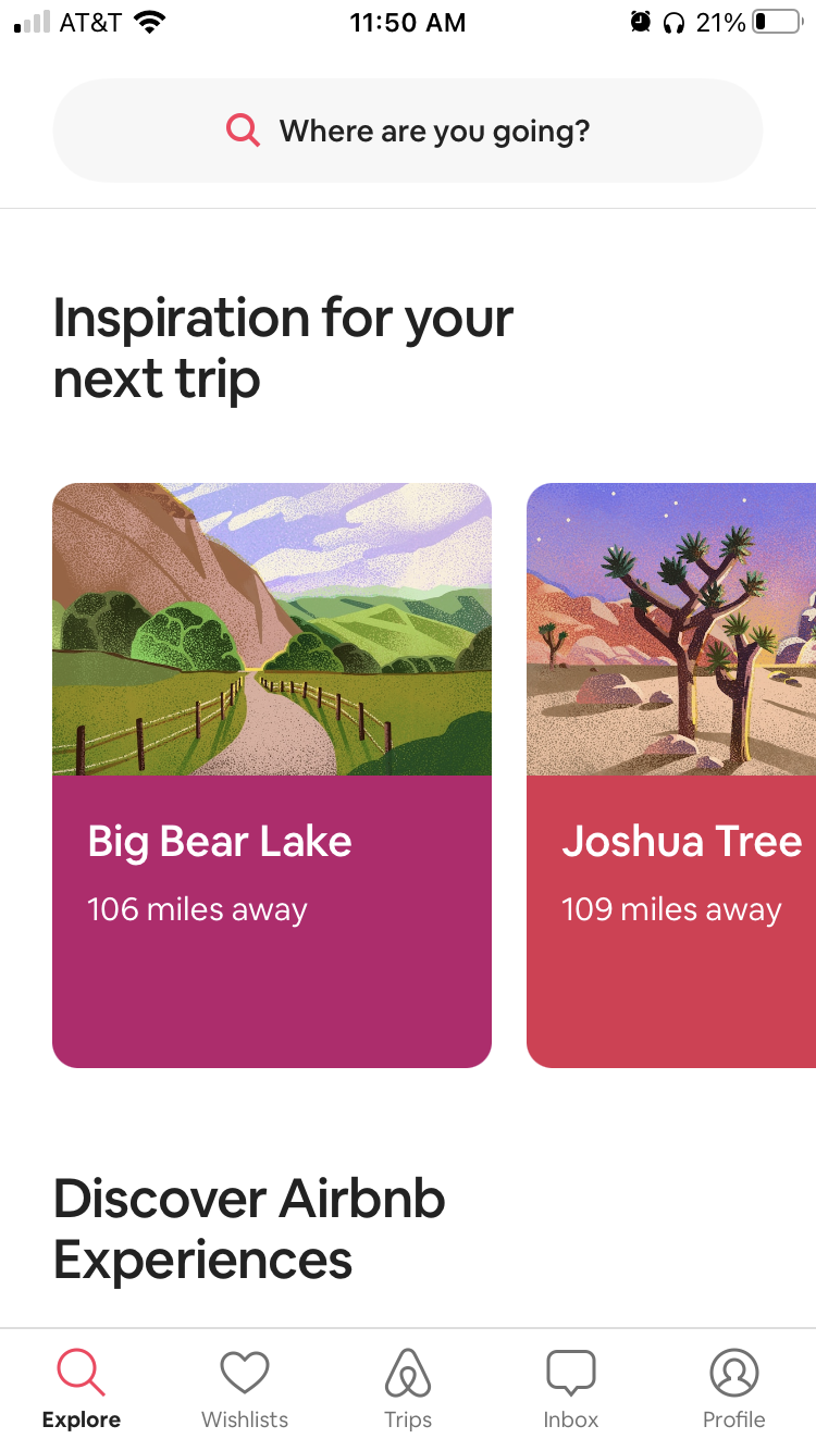
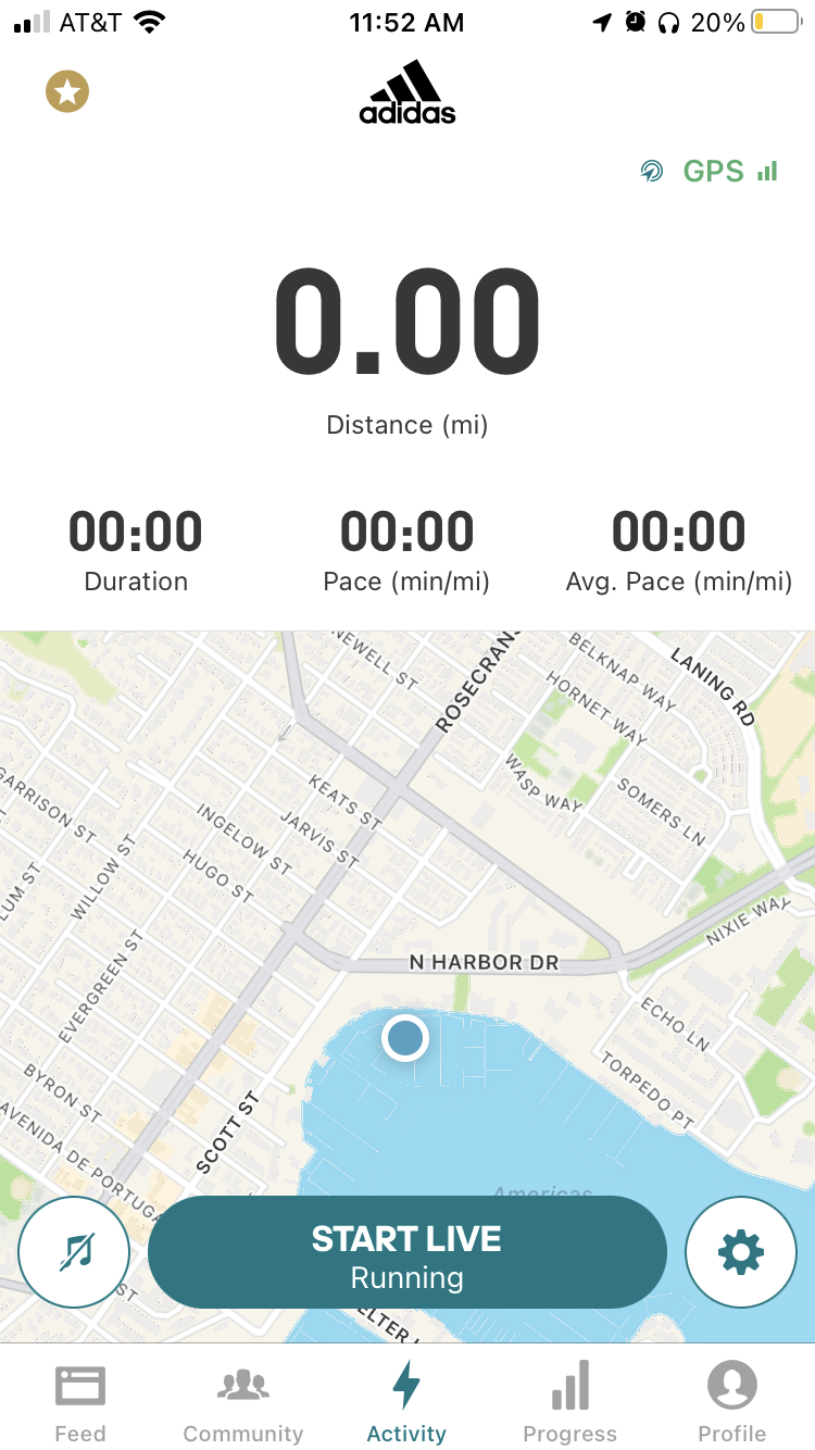
If you aren't familiar with Flexbox, or you need a refresher, practice before starting this lesson. You can try out a fun way to practice with FlexboxFroggy(opens in a new tab). Open your favorite mobile app, go to a few different screens. Notice how the screens are laid out. What makes it easy to find what you are looking for? Do you like how screens are arranged? Open up a few different mobile apps and note any commonalities you see across their screens. Especially note what differences you see from web pages. If you're the type that likes to read ahead, here are the Android and Apple-style guides: Material Design(opens in a new tab) and Human Interface Design
Building a React Native Screen
Basic React Native Components Most React Native components are so similar to HTML tags they hardly need an introduction, so as a quick guide, here are some basic components:
View
View is a box that holds content, and you can think of it like HTML
Here is a React Native View Component
<View>
    <Text> View components wrap things like text </Text>
</View>
React Native View Tag Example React Native View Component
Text
You might have guessed this one ... holds text. Think of it like the HTML
tag but also your header tags
, , etc.. . Unlike the HTML
etc.. . Unlike the HTML
tag though, you can nest
React Native Text Component
<Text>
    The text tag holds any type of text
    <Text> And it can be nested too!</Text>
</Text>
React Native Text Tag Example React Native Text Component
FlatList
This is closest to a
- &
- combo. In HTML you declare a
- and then fill it with
- elements, often by iterating over an array of data. FlatList is a little bit different in that you declare a
and then pass it an array and a component to use to render each individual row. It automatically takes the items in the array and renders them in the row component for you. There are also some performance implications of using FlatList that we will cover later. Read more about FlatList in the React Native documentation(opens in a new tab). React Native FlatList Component
const animals = [
    {id: 1, title: 'Capybara'},
    {id: 2, title: 'Armadillo Girdled Lizard'},
    {id: 3, title: 'Frigatebird'}
]

const renderAnimal = ({ item }) => (
    <Text>{item.title}</Text>
);

return (
    <View>
        <Text>This is a list of animals</Text>
        <FlatList
            data={animals}
            renderItem={renderAnimal}
        keyExtractor={item => item.id}
        />
     </View>
)
React Native FlatList Component Example React Native FlatList Component
Advanced Components
Let's get to the code. In this video, you'll watch me take a blank React Native application and build a custom screen with multiple components. We will also take a deeper look at Android and iOS specific components, some variations of the common components above, and when/why to use each variant.
Video Summary
- React Native app folder structure
- Basics of React Native screens
- Common mobile components and their variations
- View variations
- Clickable elements: Button, TouchableOpacity, Pressable
- Flatlist example
Video Code
Here is the button code I used in the video in case you want to try it out on your own. This will let you compare and contrast the different button types.
const doNormalClickThing = () => {
   console.log('Normal press')
}
const doSomethingIfLong = () => {
   console.log('Long press')
}
const doBeginningPressThing = () => {
   console.log('Begin press')
}
const doEndPressThing = () => {
   console.log('End press')
}

<Button
    onPress={doNormalClickThing}
    title="Learn More"
    color="#841584"
/>

<TouchableOPacity onPress={doNormalClickThing}>
    <Text>TOUCHABLE OPACITY</Text>
</TouchableOPacity>

<Pressable
    onPress={doNormalClickThing}
    onLongPress={doSomethingIfLong}
    onPressIn={doBeginningPressThing}
    onPressOut={doEndPressThing}
>
    <Text>PRESSABLE</Text>
</Pressable>
How to think about mobile screens
You've learned to create a mobile screen in React Native, now let's take a look at some mobile UI/UX best practices. Mobile screens share most things in common with web pages, but there are some special considerations to take into account. Here are a few top UI/UX best practices for mobile pages:
Simplify, Simplify, Simplify
Your user is likely on the go and distracted; they are going to skim headlines and buttons rather than reading content. The more you can do to simplify your mobile page the better. Targeted content, one main action, clear key points of interest, and things that help users keep track of where they are (like breadcrumbs) will be pivotal to the success of a mobile flow. It's also important to keep in mind that text sizes on mobile should be the same size or larger than on a web page.

Build for Gestures
Your users are going to be using their fingers to click, swipe, select, and pull content. Animations and styles will be important avenues of feedback to intuitively tell users if an action succeeded or failed. Fingers are also less precise than mouse clicks so be mindful of how big the "clickable" elements of your app are. This is an excerpt from a Toptal article(opens in a new tab):
Users can get physically angry and start hitting their mobile devices when they tap on something and it doesn’t respond. A study done at MIT found that they were tapping on something that had too small of a touch target. A best practice is to create controls, buttons, links, etc. (anything that’s a touch target) at least 7-10 mm which is the average fingertip width. It’s also a good idea to ensure that there is ample spacing between these UI elements.

Be Goal-Oriented
Evaluate each mobile screen by asking:
What will a user achieve on this screen?
If the page is not moving a user towards their end goal -- cut it out or move the content. Equally, if your answer is that a user can achieve lots of things in a single view, that might be too much for one mobile screen. Consider spacing out your Calls to Action and give each major action its own screen or ample separation from the others.

Mobile Layouts
Why is Flexbox so important for mobile views?
When building web pages you have lots of options when creating layouts:
- Flexbox
- CSS Grid
- Height and Width percentages
- Display block vs inline
- Absolute positioning
- and more...
But in mobile land, things are a little different. When React Native was created, CSS Grid wasn't around yet and Flexbox was the latest and greatest of modern layout tools. You can still use percents, view height, and view width in React Native, but Flexbox comes with some helpful presets just for mobile in React Native.
React Native's Flexbox Implementation
React Native implements Flexbox for build layouts, but there are some key differences to keep in mind as you develop your applications. First, all containers in React Native are flex containers by default. Recall that in traditional CSS Flexbox, you would normally define a flex container like so:
/*example.css*/

.container {
  display: flex;
}
However, this is completely unnecessary in React Native! By default, everything is display: flex;. You can just use the defaults as they are, without adding different properties or writing extra code.
Another important distinction is how React Native handles flex-direction, a property that establishes the main axis (i.e., defining the direction in which flex items are placed). In web applications, items default to row. But since we're working on mobile devices, React Native sets the default to column, which lays out items vertically.
One more major difference you'll encounter is how the flex property is used. On the web, flex specifies how a flex item grows or shrinks to manage the space around it (along the main axis). In React Native, flex is generally used with flex items that are on the same level but hold different flex values. For example:
import React from 'react';
import { View } from 'react-native';

const FlexDemo = props => (
  <View style={{ flex: 1 }}>
    <View style={{ flex: 1, backgroundColor: 'red' }} />
    <View style={{ flex: 2, backgroundColor: 'green' }} />
    <View style={{ flex: 3, backgroundColor: 'blue' }} />
  </View>
);

export default FlexDemo;
Here, FlexDemo is a stateless functional component that renders
components with different flex values. Its outermost container is set to flex: 1, which will expand the full available width along the main axis (i.e., the entire screen in this example). Its children components will fill the space accordingly, rendering a blue background color that takes up three times as much space as red takes, and green that takes up exactly twice as much space as red takes. Other Differences
In addition to the above, here is a list of defaults in other common CSS properties that React Native applies to components:
box-sizing: border-box;
position: relative;
align-items: stretch;
flex-shrink: 0;
align-content: flex-start;
border: 0 solid black;
margin: 0;
padding: 0;
min-width: 0;
Mobile Screens and Thumb Zones
What makes a good mobile layout? There is always the visual and aesthetic aspect of a design and layout to think about, but on mobile, we are met with another thing to take into account - what is easy for people to reach?
Mobile UI research has actually broken down phone screens into what areas are easy for users to reach and interact with, and which are difficult.
If you can grab a mobile device. Take one hand and try to reach all 4 corners of the screen. You will find just like the researchers did that some areas are really easy, some are a little tricky, and there are just some spots that are really hard to reach. You can repeat this with the other hand and both hands. To see a graphic of the easy and difficult places to reach, see here(opens in a new tab).
This concept originated in a book called "Designing Mobile Interfaces"(opens in a new tab) by Eric Berkman and Steven Hoober where they defined the thumb zone as "the most comfortable area for touch with one-handed use." The furthest edges of the screen are the hardest to reach, and the left side of the screen is the hardest to reach for the majority of people because most people are right-handed.
Ever wonder why mobile navigation is often on the right? We read left-to-right so we often put pertinent information to the left to start with, but on phones, the top left is the hardest place to reach for right-handed users, so the navigation moves to the top right. A reach, but still accessible.
Resources
There are some really good resources and articles written around this topic, here are a few you might find interesting:
Smashing Magazine article on Thumb Zone Design for Mobile(opens in a new tab) Get Feedback article on Designing for Thumbs(opens in a new tab) Volusion blog post on Does your mobile site pass the thumb zone test
Styling Mobile Content
Before we jump into how CSS in JavaScript works, let's check out an example of some "normal" HTML and CSS:
.avatar {
  border-radius: 5px;
  margin: 10px;
  width: 48px;
  height: 48px;
}
Nothing too surprising! But since we're not using HTML or CSS files to build mobile apps -- how would this look in React Native?
First, it's important to know that all of the core components in React Native can accept a prop named style. One way we can leverage this prop is to provide styling to components with inline JavaScript objects:
function Avatar () {
  return (
      <View>
           <Image
               style={{ borderRadius: 5, margin: 10, width: 48, height: 48 }}
               source={'static/images.png'}
           />
      </View>
  );
}
In the example above, the Imagecomponent receives two props:
- Style
- Source
The value of style is just a plain old JavaScript object with borderRadius, margin, width, and height properties. Keep in mind that unlike CSS on the web, properties are written in camelCase (i.e., borderRadius in CSS in JS, but border-radius on the web).
This works, but things can get muddy quickly. Imagine if the inline object contained a dozen properties, or if we wanted the same style to apply to more than just one component! Let's take a look at some better ways to handle mobile styling in this video.
Styling Android vs. iOS
Not only are there fundamental differences between native apps and web apps, but you'll also find differences between how native platforms (iOS and Android) look and feel as well. Perhaps the most apparent is the distinct design philosophies on each platform: Android apps utilize Google's Material Design(opens in a new tab), while iOS apps take advantage of Apple's Human Interface Design(opens in a new tab). When designing mobile applications, it's important to your users that an iOS app feels like an iOS app, and an Android app feels like an Android app.
Navigation between screens feels distinct between Android and iOS as well. Android devices have access to a navigation bar at the bottom of the screen, which allows users to go back to the previous screen (among other features). On iOS, the approach is different: there is no such universal navigation bar! When building the UI for an iOS application, it is important to include a back button (perhaps on a custom navigation bar) to help guide users through your app.
One more key difference between Android and iOS involves tab navigation. iOS apps include tab bars at the bottom of the app's screen, allowing for convenient access to different portions of the app. Likewise, Android apps include them as well; however tabs are distinctly located at the top of the screen. Both allow access to high-level content, and we'll explore these in the next lesson: Navigation in React Native.
Lesson Review: Mobile Screens and Styling
In this lesson, we learned all about creating mobile layouts and how to style screens. Here is a recap of the topics we covered:
- Basic React Native components and their HTML equivalents
- UI/UX best practices for mobile screens
- React Native components for creating layouts
- The React Native implementation of Flexbox
- The React Native StyleSheets API
- Organizing code in a React Native project
Going Further
Here are some resources in case you want to deepen your knowledge of these topics:
Mobile UI/UX
- Adobe Mobile Design Best Practices(opens in a new tab)
- UX Collective's Mobile UX Design Principles(opens in a new tab)
- Toptal Mobile Design(opens in a new tab)
- Google's What Makes a Good Mobile Site(opens in a new tab)
React Native Components
- React Native Documentation(opens in a new tab)
- React Native Express Tutorial: Layout(opens in a new tab)
React Native Flexbox
- React Native Flexbox Documentation(opens in a new tab)
Conclusion
Hopefully, this lesson was a light and fast introduction to React Native components and styling. We needed to do this foundational work to ensure you had the tools you need for the coming lessons, but from here on out we will move a bit faster and cover deeper topics. Get ready for the adventure that is mobile navigation in the next lesson!
- elements, often by iterating over an array of data. FlatList is a little bit different in that you declare a
